London, UK


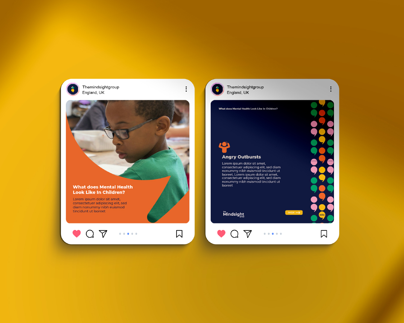
Mindsight Group exists to shift the conversation around mental health into something approachable yet professional. They stand on the values of integrity, accountability, innovation, and collaboration, which were at the heart of their brand direction. The goal was to present a sensitive subject in a way that feels engaging, educational, and digestible rather than overwhelming.
The identity uses the semicolon — a widely recognised mental health symbol — reimagined through colourful iterations to represent the brand’s four values. This creates a visual system that is both symbolic and flexible, instantly recognisable across touchpoints. Balancing the professionalism of the typography with the warmth of the colour palette, the design positions Mindsight Group as trustworthy while remaining approachable.